Monday 7 March 2011

Finished poster..


So after playing around with the design, and adding to the background of the piece, i decided that this outcome was far more eye catching than the other two.
The font decreases in size bringing the attention to the top of the type and leading it down to the bottom. 
i feel that this piece portrays the message and cleverly incorporates the paper which it is advertising to do so. 

Sunday 6 March 2011

developing my final poster....

After playing around in photoshop for a while and using different angles of the piece for my background, i developed these two posters, cant quite decide which i prefer :/....


Throughout both of these images the use of the golden section is very apparent, both heavily designed within the 2/3's of the image, and a less designed bottom third. 
The angle of the shot in the second one draws me to prefer that one more, but i also liked the plain background of the first image.. 
so as i wasn't happy with that outcome i decided to play a bit more, with the design and incorporate some of the swirls that Yulia Brodskaya used in her work...

maybe i wasn't so good at that..?

After experimenting with the style of work that Yulia Brodskaya produced, and realising i was in-fact, rubbish at it. So i decided to move on and experiment with other methods.. I still wanted to use the paper to create my font but just didn't know how yet. 
so after many more hours researching i found other artist that worked with paper and type and found interesting images and artwork such as..

                                      (http://inspiredology.com/whos-your-type/)

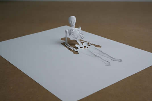
After looking at this image and thinking of ways this could effect my work, i realised it reminded me of the pop-out effect sometimes found in books.. I then remembered another artist that id previously looked that related to the pop up art, during task one was Peter Callesen. 
His work was created by using one single piece of paper and taking away from it shapes that would form another sculpture when folded away from it.


After looking at these images i thought of ways of using this idea but with type instead of sculptures, and here a quick attempt i did in my sketch book....


This is a really awful attempt, but i quite liked the ideas i had that i could use this technique with so decided to carry on with this idea.
The information that was compulsory to have on the poster was..
                       '100 Years of GF Smith Paper, Design museum, 1st-31st July.'
So after this awful attempt i thought i'd better do a good one,  and these are the results..


After creating this piece i decided that i'd whack the images into photoshop and see what kind of poster ideas i could create...

Type using paper?

After looking at artists and designers for the first task, i had already decided that i wanted to incorporate type into my poster using the paper

Yulia Brodskaya
An artist that does this beautifully is Yulia Brodskaya. I have looked into her work closer earlier on my blog but wanted to look again at the way she uses type as a main feature within her work..

She combines fantastic and beautiful design to create innovative and extremely precise design work. Her work is varies as to what colours, and how busy a piece is, but generally speaking her work is normally quite simplistic.
Using inspiration i got from looking at her work, i decided to have a go myself, didn't quite work out as well as her work but worth a try...


Task Two - 100 years of GF Smith Paper...

GF Smith Paper.
After finishing Task 1 its now time to get crackin' with Task 2 - a poster to celebrate 100 years of GF Smith paper. 
I decided to look at their website to get a feel of what type of things they produce and what their company is about..
Their website portrays quite a minimalistic feel, usually with one focal point, some examples of this from their website are...


I also researched into the logo for this company so i knew what kind of look my poster had to fit in with...


The final thing.

Finitoooo... 
After using 3 whole glue sticks, half a roll of fishing wire, 126 pieces of white card, the final piece was finished. I then constructed a make shift studio out of a bed sheet and a spot light so i could photograph my sculpture, and this was the final result.


Saturday 5 March 2011

..in the making.

After experimenting with different shapes and different curved edges i decided on a basic shape that i was going to repeat to create my final 3D sculpture. 

i measured out a template and used it for the larger sized petals for my sculpture. After i had created a few of these i decided to make the template smaller and carried on making the template smaller to create more of a flower shape. 
After all the petals were attached together and left to dangle, the shape looked something like this...

I then started at the smaller end of the petals, and curled the sculpture up inside its self, this automatically created the flower like shape.
I feel that the tabs i used to attach the separate sections together add to the structure and show more definition to each petal.
After making several of these flowers, varying in size, i attached them all together to begin the final production. 


 This is a picture of half the finished piece, just to show how the structure takes form when all the pieces are attached together.